The Today page is the first thing you see when you log into ArrivHQ. It is your morning briefing — what is happening across your properties right now, what needs your attention, and what is on track. The previous version showed a basic list of today's events. The new version turns that list into something you can actually act on without clicking through to five other pages.
Rich reservation cards
Every reservation on the Today page now displays as a full card with the information you actually need. Guest name, contact phone number, email, and the reservation dates are visible without expanding anything. The check-in and check-out times are shown alongside the property name and unit.
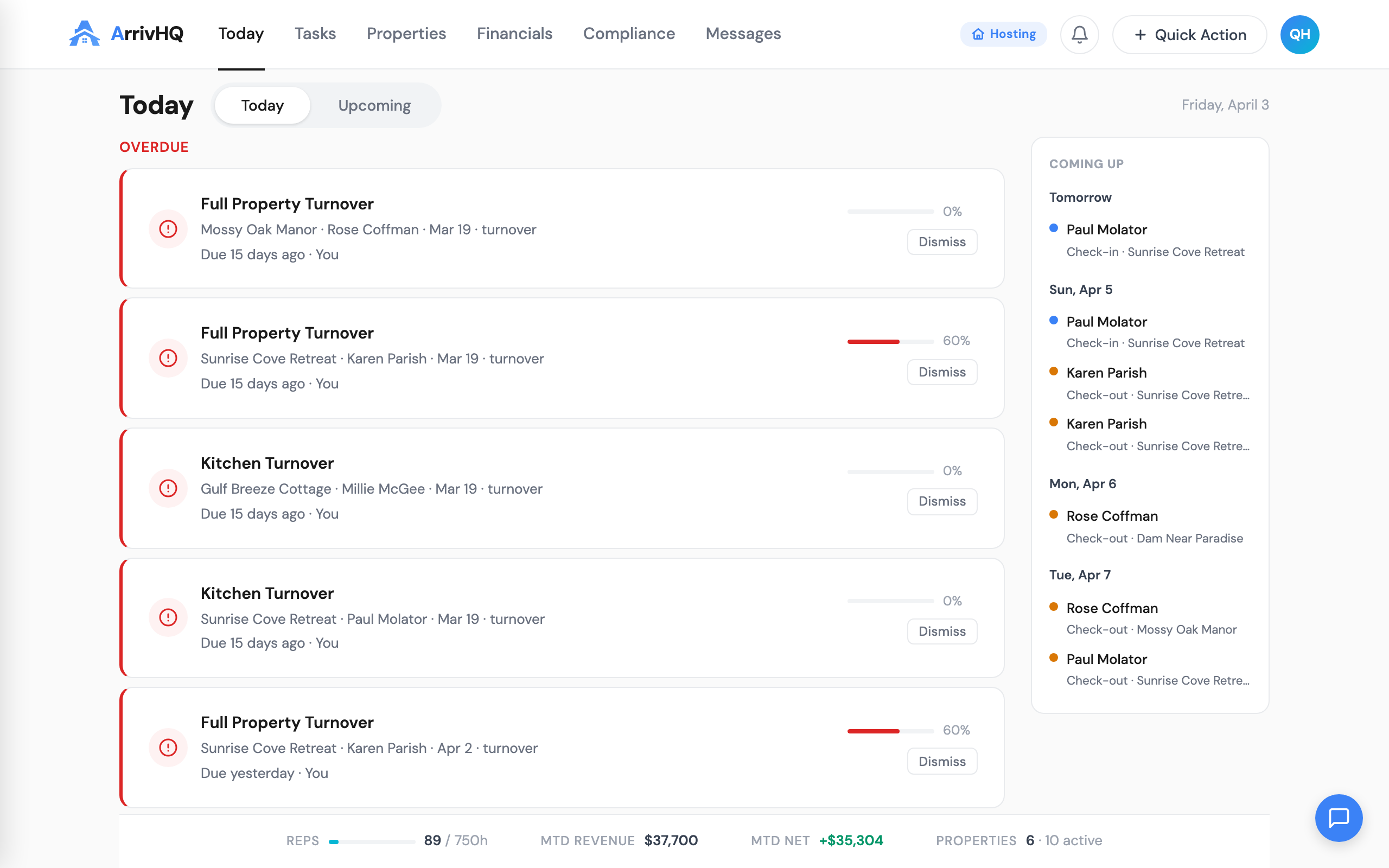
Each card includes an inline status stepper. This is a horizontal progress indicator showing where the reservation currently stands in its lifecycle — confirmed, checked in, in progress, checked out. You can see at a glance whether a 3 PM check-in has actually happened or is still pending. No need to open the reservation detail page to answer that question.
Below the status stepper, checklist progress is split by audience. Host checklists (turnover, inspection, maintenance) show their completion percentage separately from guest checklists (check-in, check-out). This split matters because a reservation where the cleaning is done but the guest has not completed their check-in form tells a different story than one where both are at zero.
The cards are dense by design. Each one answers the question "what do I need to know about this reservation right now" in a single visual block. If everything is green and progressing, you skip past it. If something is red or stalled, you click in.
Stat gauges sidebar
The right side of the Today page now includes a stat gauges panel. Two progress rings show check-in and check-out completion rates for the day — the percentage of expected events that have actually occurred. Below the rings, count indicators show the number of pending items in each category.
These gauges answer the most common question managers ask throughout the day: "how are we doing?" At 10 AM, seeing 2 of 6 check-outs completed tells you something different than seeing 6 of 6. At 4 PM, seeing 1 of 4 check-ins completed tells you there might be a problem. The gauges provide that signal without requiring you to count cards mentally.
The gauges update in real time as checklist completions and status changes come through. They are not a static snapshot from when you loaded the page.
Needs Review: the management-only section
Below the day's reservations, a Needs Review section surfaces items that require human judgment. This section only appears for owners, admins, and managers — cleaners and maintenance staff do not see it, because the items it contains are not actionable at their level.
Missed check-ins appear with a red indicator. These are reservations where the expected check-in time has passed and no check-in confirmation was recorded. This could mean the guest is running late, the guest checked in but did not complete the form, or there is an actual problem that needs a phone call.
Missed check-outs appear with an amber indicator. Same concept — the check-out window has closed and no confirmation came through. Amber rather than red because a missed check-out is less operationally urgent than a missed check-in. The property still needs attention, but nobody is standing at the door waiting to get in.
The color coding is intentional and consistent. Red means "this might need immediate action." Amber means "this needs attention but is not an emergency." These are the only two colors in the Needs Review section. If you see nothing there, your day is going according to plan.
Per-type color coding
Throughout the Today page, items are color-coded by type to make scanning faster. Checklist items use purple. Task items use green. Guest items use blue. This coding is consistent across every page in ArrivHQ, but it matters most on Today because this is where all three types appear together in a single view.
The color coding is not decorative. When you are scanning a list of 15 items across four properties, color lets your eye jump to the category you care about. If you are focused on guest check-ins, you look for blue. If you are checking on your cleaning team, you look for purple. If you are tracking maintenance tasks, you look for green.
Property filter
A property filter at the top of the Today page lets you scope everything — reservation cards, stat gauges, Needs Review items — to a single property or a subset of properties. The filter persists within your session, so if you are spending the morning focused on one property, you set the filter once and everything adjusts.
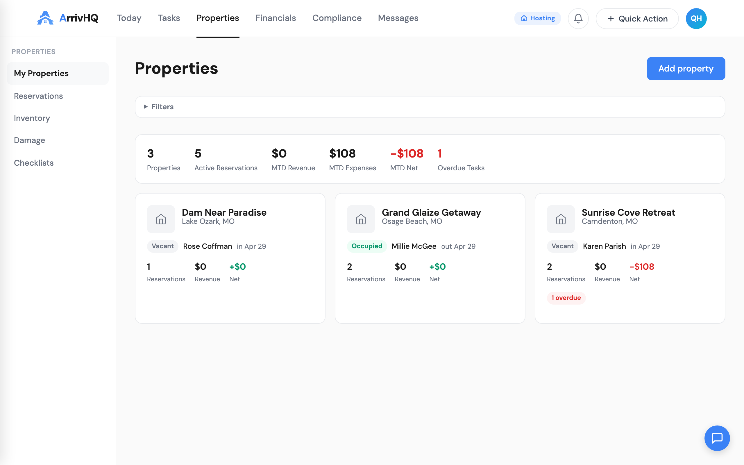
For single-property hosts, this filter is invisible. For multi-property operations, it is essential. An owner with eight properties does not need to see all eight at once while troubleshooting a missed check-in at one specific unit. The filter removes the noise.
The filter also interacts with the stat gauges. When filtered to a single property, the check-in and check-out rings show percentages for that property only. This lets you compare properties quickly — filter to property A, note the numbers, filter to property B, compare.
What changed and why
The previous Today page was a list. It showed what was happening, but it required clicking into individual items to get useful detail. The new Today page is a dashboard. It shows what is happening, how things are progressing, and what needs your attention — all in one view.
The underlying data is the same. No new information is being collected or generated. The change is entirely in how that information is presented. Reservation details that were one click away are now zero clicks away. Completion rates that required mental arithmetic are now visual. Problems that required scrolling through a list to spot are now surfaced automatically in Needs Review.
For hosts managing one or two properties, the new Today page is a convenience. For hosts managing five or more, it is a meaningful reduction in the time spent figuring out what needs attention. The goal is to get you from "logged in" to "I know what to do next" in under 30 seconds.
Related documentation: