Not everyone on your team needs to see the same thing. A cleaner arriving at a property needs exactly one thing: the checklist for that unit, right now. A manager overseeing four properties needs the opposite — a wide view of what is done, what is pending, and what needs attention. When a tool forces both people into the same interface, somebody loses.
ArrivHQ now adapts its interface based on who is logged in. The same app, the same URL, but the content, navigation, and available actions shift to match the role. No separate apps, no configuration toggles, no "simplified mode" checkbox buried in settings.
The operations lane: cleaners and maintenance staff
When a cleaner or maintenance team member logs in, the experience is stripped to essentials. The Today page shows only items assigned to them — no portfolio stats, no revenue numbers, no reservations they have nothing to do with. The sidebar navigation hides pages they cannot access. There is no temptation to click into the wrong place because the wrong place does not exist in their view.
The Tasks page defaults to "My Tasks" automatically. A cleaner does not need to filter a list of 40 tasks across five properties to find the three that belong to them. The filter is already applied. They open the app, see their work, complete it, and move on.
This matters for adoption. The single biggest reason field staff stop using a management tool is friction. Every extra tap, every irrelevant screen, every moment spent figuring out "which of these is mine" erodes willingness to use the system. The operations lane removes that friction entirely.
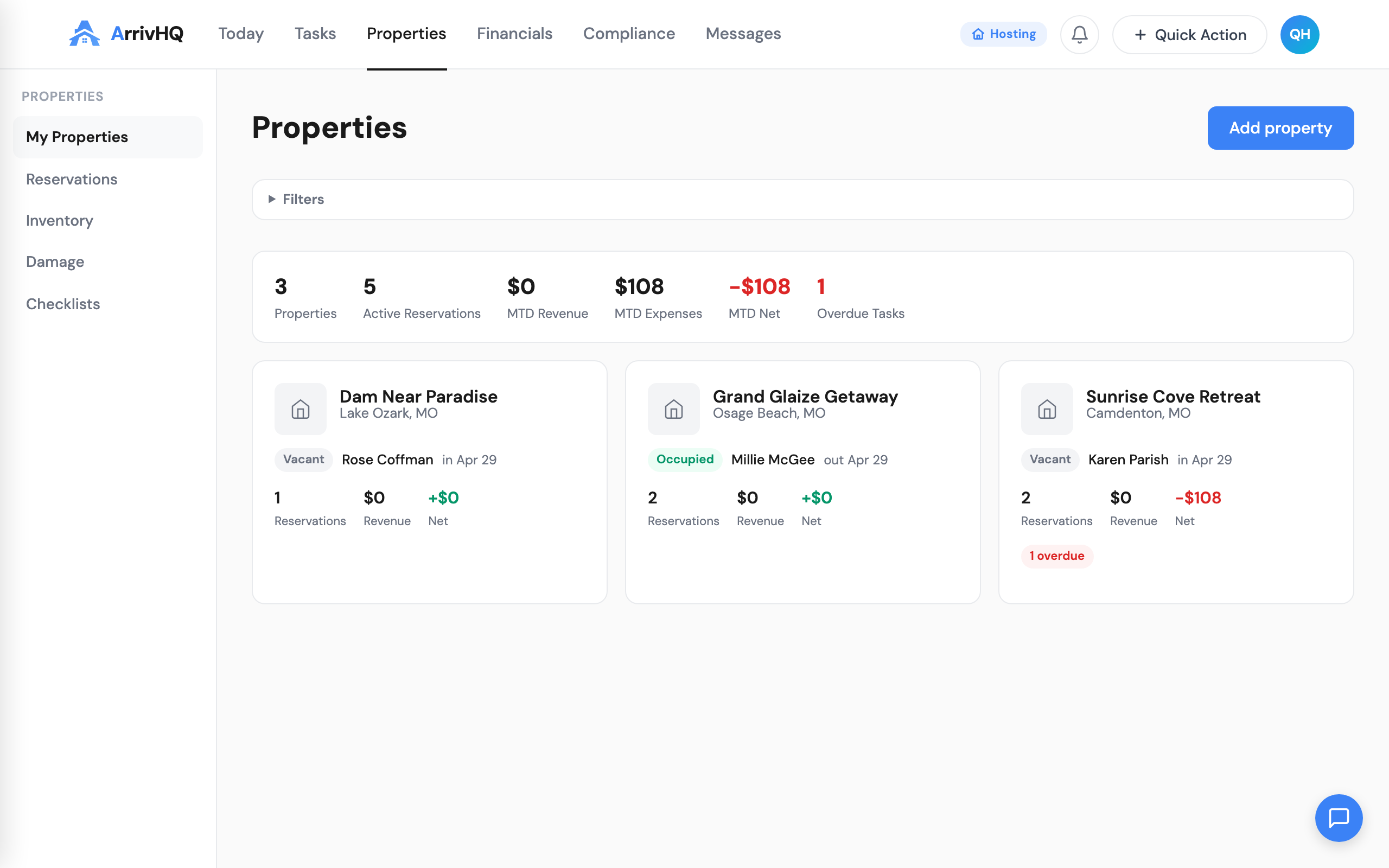
The management lane: owners, admins, and managers
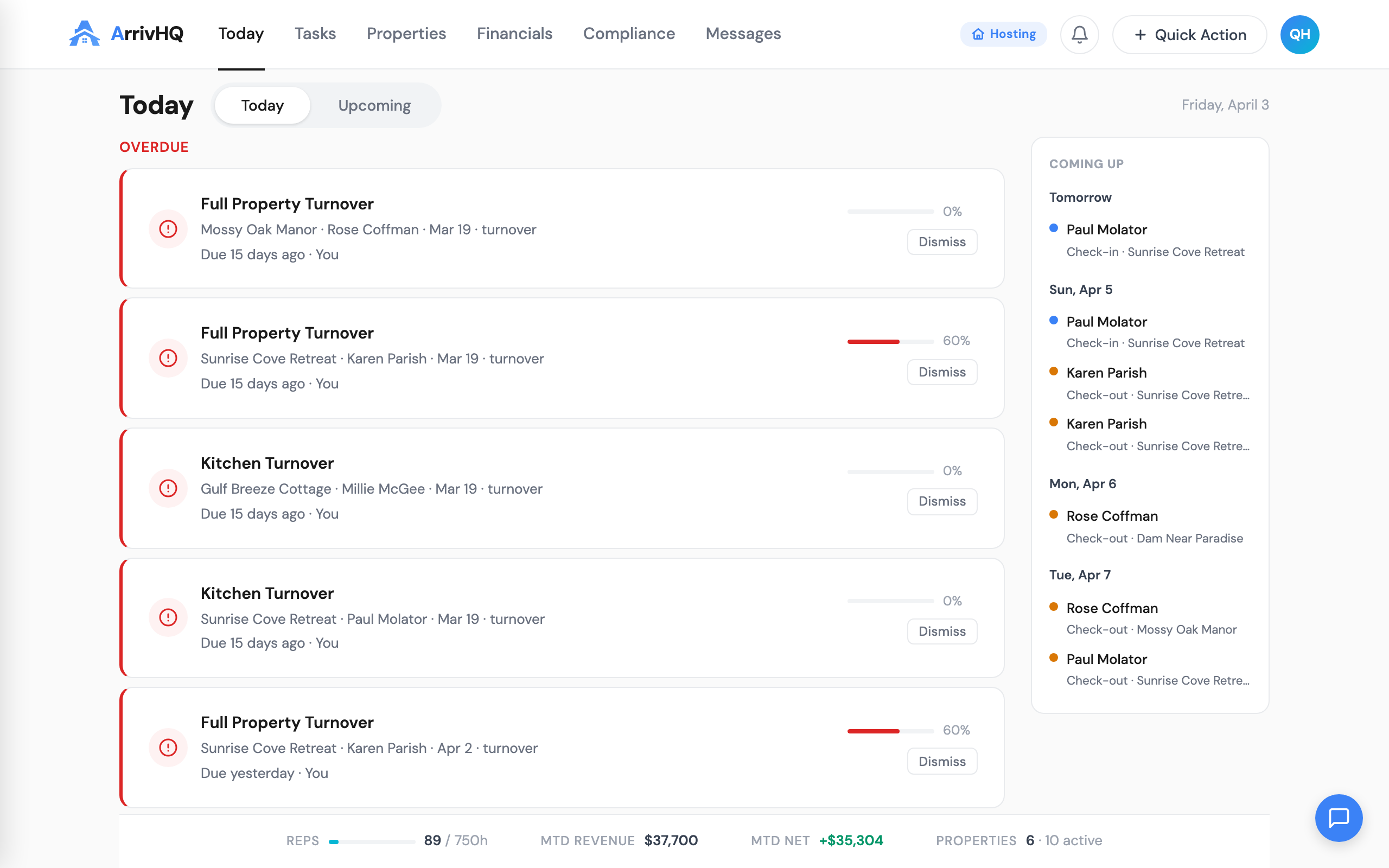
Owners, admins, and managers see the full picture. The Today page includes stat gauges — progress rings showing check-in and check-out completion rates for the day, count indicators for pending items, and a Needs Review section that surfaces problems requiring human judgment.
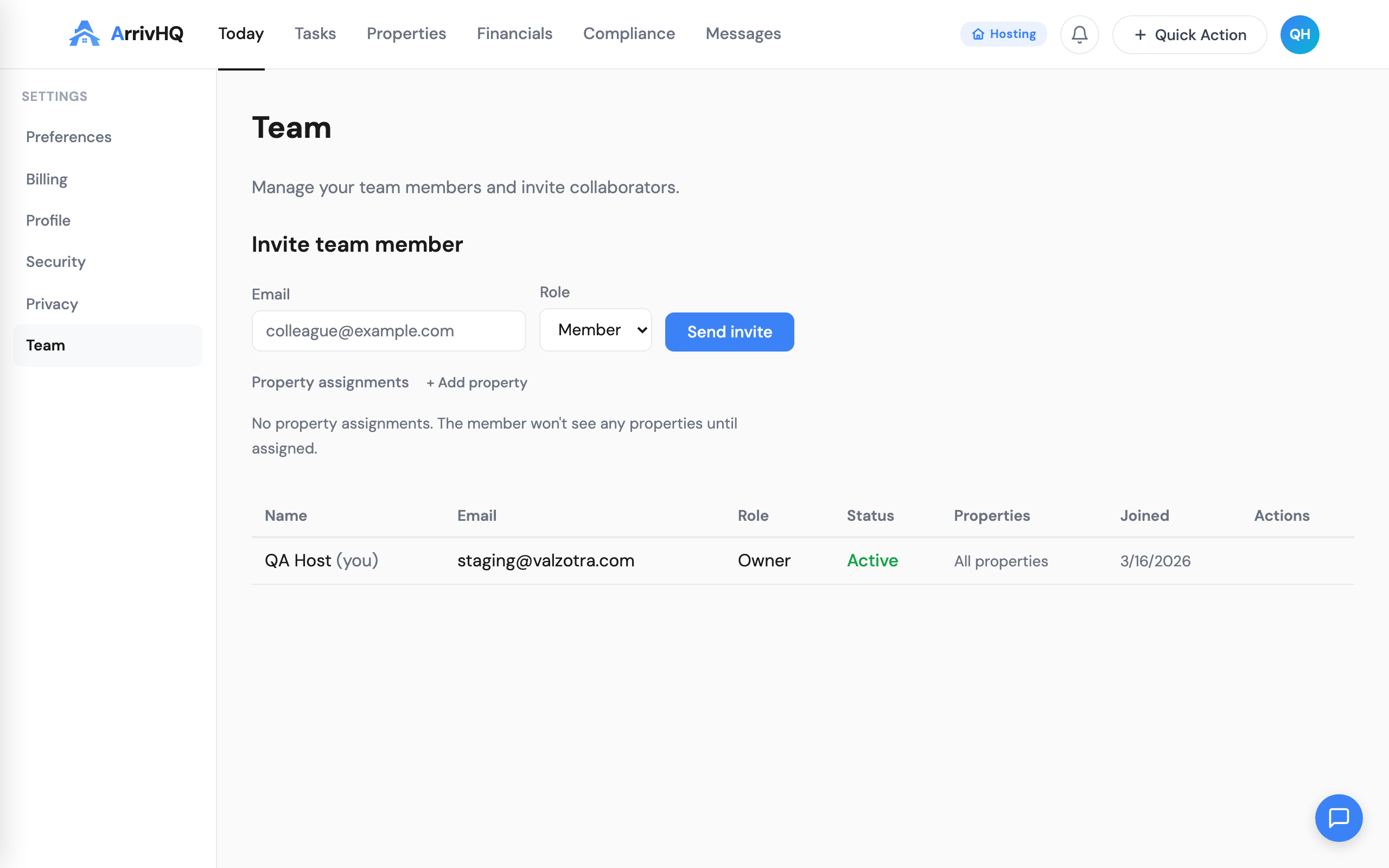
The management lane includes everything the operations lane hides: full reservation details, financial data, team management, property settings, calendar sync configuration, and the AI concierge. Managers assigned to specific properties see those properties. Owners and admins see all of them.
The key addition for managers is the Needs Review section. Missed check-ins appear in red. Missed check-outs appear in amber. These are items where something did not happen on schedule — a guest did not check in when expected, or a check-out confirmation never came through. Only management-tier roles see this section because only they have the context and authority to act on it.
Shared checklist completion: one standard for everyone
Previously, the checklist completion experience differed between host-side and guest-side users. Hosts had a simpler interface. Guests had a more guided flow with scroll gates, step cards, and photo upload prompts. That gap created an odd situation where the people doing the most frequent operational work — your cleaners — had the less polished experience.
That is fixed. The host completion UX now matches the guest experience in quality and structure. Step cards walk through each item. Photo uploads are prompted where configured. A scroll gate prevents skipping ahead without reviewing previous steps. The completion flow is identical regardless of who is doing the work.
This consistency matters beyond aesthetics. When a cleaner completes a turnover checklist with photos at each step, the result is the same structured evidence trail that a guest check-in produces. Managers reviewing completed checklists see the same format whether it was completed by staff or by a guest. No mental translation required.
Audience unification: one checklist, multiple audiences
The old model required separate checklists for hosts and guests. If you wanted both a cleaner and a guest to complete a check-in process, you created two checklists with overlapping steps. Maintaining both meant double the editing work, and they inevitably drifted out of sync.
Any checklist can now serve host users, guest users, or both. The audience setting is a property of the checklist itself, not a structural division. A turnover checklist assigned to your cleaning team can be extended to include guest-facing steps — or kept host-only. The choice is per-checklist, not per-system.
This simplifies the mental model. You are not managing "host checklists" and "guest checklists" as separate categories. You are managing checklists. Some are for your team. Some are for guests. Some are for both. The interface does not force you to think in categories that do not match how you actually operate.
What this means in practice
A five-property operation with two cleaners, a maintenance contractor, and a manager now works like this: the cleaners log in and see only their assigned turnovers and tasks for the day. The maintenance contractor sees inspection and repair items. The manager sees everything — completion rates, missed items, stat gauges, and the full reservation timeline. Nobody sees anything they do not need.
The result is less noise for field staff and more signal for managers. Your cleaners spend less time in the app and more time cleaning. Your managers spend less time asking "did that get done" because the answer is visible in the dashboard.
For teams that were already using ArrivHQ with role assignments, this update takes effect automatically. No migration, no re-configuration. The interface adapts based on existing role data. For teams that have not set up property-level roles yet, head to Settings and assign your members — the adaptive views activate immediately.
Related documentation: